The foundation of a website or mobile application is user experience (UX). It creates the basis for a fantastic digital product. But when creating a software program, designers frequently commit some UX blunders. What UX faults did these mobile apps make? We’ll get the answer later in this blog post.
From the time users first enter an application until they leave, every UX designer works to give them a great browsing experience. For this to occur, the app must make a good initial impression, foster meaningful connections, and efficiently navigate users within the app. Users will eventually switch to your competition if it doesn’t live up to their expectations.
Nowadays, users rely extensively on smartphone apps for practically all types of tasks, including placing restaurant orders, reserving cabs, and sending money. There are currently a lot of apps in the app store that enables users to perform necessary tasks, but only those apps stand out that have a strong UX design. Therefore, it’s crucial to focus on providing the best user experience possible while creating a mobile app. Anything short of the ideal will give the rival apps the advantage.
Let’s look at some typical UX blunders to avoid if you want to reduce bounce rates and keep visitors interested while they use your website or mobile application.

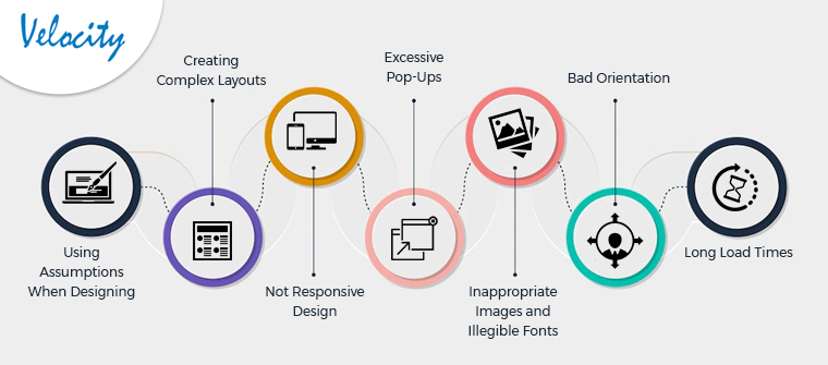
1. Using Assumptions When Designing
Designing experiences based on presumptions is one of the mobile app UX blunders that some designers frequently do. This is not a wise method. To design optimal user personas, one must first undertake thorough research on market trends, competitive analysis, and target audience. When you make decisions on your own without gathering a lot of data, it becomes quite difficult to later satisfy the demands and expectations of the users. If a product is not developed with the demands of the target market in mind, it may not be successful. Therefore, rather than making assumptions, gather pertinent data and then develop the UX design accordingly.
2. Creating Complex Layouts
A user-friendly, straightforward, and intuitive layout is essential to great UX design. Overly complicated layouts can annoy and confuse users. On top of that, a subpar UI can worsen the situation. The app’s controls and features should be easily visible. Features must be easy to use; if not, a quick instructional (technically known as coach markings) can be added to help users understand what each feature stands for or how it functions. Users seek out solutions that swiftly and easily meet their demands and want a straightforward user interface.
3. Not Responsive Design
Not employing a responsive design can be added to the list of major UX design errors. Nowadays, the majority of people use smartphones to complete all tasks, thus the website design must look just as nice on a mobile device as it does on a desktop. Consider utilizing a responsive design to ensure that the website’s elements look fantastic on all users’ devices.
A non-responsive design may cause website elements to load incorrectly and perform wrongly on mobile devices, which could result in a bad user experience and a high bounce rate. Make sure the information being presented doesn’t interfere in any way with how the user navigates the site and maintains their interest in the material. Not employing a responsive design can be added to the list of major UX design errors. Nowadays, the majority of people use smartphones to complete all tasks, thus the website design must look just as nice on a mobile device as it does on a desktop. Consider utilizing a responsive design to ensure that the website’s elements look fantastic on all users’ devices.
A non-responsive design may cause website elements to load incorrectly and perform wrongly on mobile devices, which could result in a bad user experience and a high bounce rate. Make sure the information being presented doesn’t interfere in any way with how the user navigates the site and maintains their interest in the material.
4. Excessive Pop-Ups

The saying “too much of a good thing is bad” also holds for pop-up advertisements. Too many popups degrade the user experience and are, thus, included in the list of typical mobile app UX blunders, despite being one of the marketing teams’ preferred methods for increasing conversion rates. They frustrate consumers since they have to close the pop-up window repeatedly in addition to deterring them from their intended goal. Imagine a visitor to your website or app seeing popups one after the other. One or two popups, and that too after a pause, ought to be effective. Do not overuse them.
5. Inappropriate Images and Illegible Fonts
There is nothing wrong with making designs using unique typefaces, but if the words can’t be read, there may be problems. When trying to think of fresh and original design ideas, UX designers frequently disregard the letters that makeup words. Pick a classy combo. Consider the number of words used while using a novelty typeface, as well as how readable it is.
Using inappropriate imagery is another typical UX error that designers commit. Despite all the work, poor aesthetics could still ruin a poor UX. Using visuals that don’t seem to match the message is pointless. Do not use popular web images. Use those that relate to the subject or the material. Use high-quality photos, which is most important. Never accept low-resolution pictures as the norm.
6. Bad Orientation
One of the most crucial aspects of a UX design is probably how effortlessly a user can move between different points. Users will leave your website or mobile app immediately if they have problems navigating it. One of the frequent errors in UX design that designers make is poor navigation.
You must make sure that users may easily and trouble-free navigate around the entire website to provide a better user experience. Whether it’s in the menu bar, header, or footer, the user experience should be simple and stylish.
7. Long Load Times

Now, pages must load more quickly, it is no longer an option. Users prefer to explore programs or websites that load rapidly. In addition to frustrating users, slow loading forces them to leave the website. This can be because the website or app has too many photos and other components. Therefore, in order to hasten page loading and increase user engagement, designers must strictly focus on optimizing the web pages while they are being produced. Correcting this UX design blunder would improve the performance of your website. Google itself favors ranking websites in the SERPs that provide quicker page loads.
Final Thoughts
Numerous additional factors, such as the use of difficult forms, coercive user registration or signup, poor app architecture, a lack of white space, etc., also point to poor user experience. In addition to all of this, designers should take seriously the importance of listening to and implementing user feedback. Check out user reviews of your website or app. Your users are the best judges you can have, and they can provide you with the most honest criticism. Therefore, usability testing should be done. Our team of highly skilled and qualified UI/UX designers at Velocity makes sure that your application doesn’t include any such UX flaws.


