Well, the year has almost come to an end now and in a matter of a few months, 2019 will be right here. As we enter in the last quarter of 2018 and looking to the future to see what Mobile SEO trends 2019 will hold is important. In terms of Mobile SEO in 2019, the trends seem to be revolutionary. If you want to check out the components of Mobile SEO in 2018, you can very have a look at them here.
Smartphones and tablets have revolutionized the way we experience online content. Website design has become simpler, and the content has been rearranged to display the most meaningful information first. With mini computers floating in pockets everywhere, search engine optimization (SEO) for mobile sites is crucial to harnessing the potential of any business.
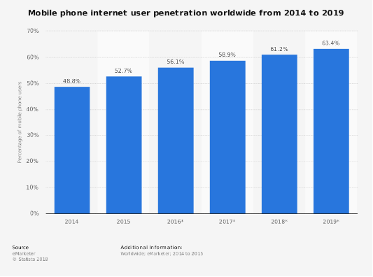
If you take a look at the number of Mobile phone internet user penetration worldwide from 2014 to 2019, you’d come to an understanding that it will grow by 63.4% by the next year.
Picture credit: ICO Web Solutions
Now, that Google has started serving AMP (Accelerated Mobile Pages) version of web pages on SERP, because of fast loading and easy interface, every eCommerce website is trying to focus on mobile optimization. Well, you should know that even the tiniest elements of your website can affect the traffic and leads. So making a website perfect for the smartphone is a profitable deal. Because many of the optimization methods need time and less money, but in return, your website will do better on SERP, means more leads and money. So, what are the things that the eCommerce marketers should be considering when you optimize it for the mobile users?
This blog talks about the various essential elements of mobile SEO that would reign in the 2019 and you should start gearing up to get your mobile website on track accordingly.
The design of the mobile website
Mobile visitors want to see a version of your site with colors, themes, and content similar to the main site so they can be certain that they’re on the right site. However, for mobile devices, more is always less. For example, with the decrease in the size of the screen (desktop to the smartphone), there are other elements too that would also change. Rather than cluttering the screen by displaying all the products/elements at once like the desktop, you can place the elements one or two at a time. Cluttering your mobile website with a lot of elements would irritate the users. According to the Blue Corona, “38% of people will stop engaging with a website if the content/layout is unattractive.” In fact, the study also states, “48% of people cited a website’s design as the number one factor in deciding the credibility of a business.” Be clear about what you want your visitors to know about your business – don’t crowd the message with unnecessary information or too many buttons.

Picture credit: Web Media Makers
Hence, an effective design is all about optimized images, text, and column formatting.
The Page speed
If you compare the mobile users and desktop users, it is the mobile users are generally on the go. Well, if you really want to know how your website is doing in terms of the page speed, you can check it out here. Google rolled out the PageSpeed Update earlier this year in July and it is an essential ranking factors. What this means is that page speed is now a ranking factor for websites in mobile searches (from phones and tablets). If your website runs slowly on mobile devices, you should make some changes to get it loading quicker.
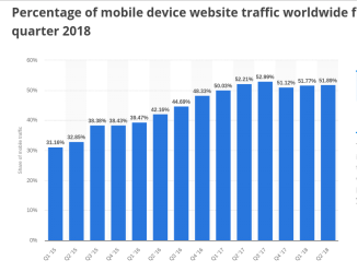
Moreover, according to Statista, more than 50 percent of website traffic is performed on a mobile device. If you are considering mobile SEO tips that would make your business successful, make the changes to be mobile-friendly.
Picture credit: Statista
You can improve your mobile page-speed issue by doing the following:
Optimizing the images: changing their size and compressing them so they don’t take as much time to load. Using special effects only where they’re needed: optimizing the special effects and using them only where they’re needed would also help the loading time speed up. Take advantage of the browser cache. Think about AMP: AMP or Accelerated Mobile Pages is a Google-backed project that is designed as an open standard for any publisher to have pages load quickly on mobile devices. In February 2016, Google officially integrated AMP listings into its mobile pages. Once your web pages enhanced by AMP, the loading speed will be better.
Meta tags – descriptions and titles
Meta tags are part of the HTML tags that describe your page content to search engines and website visitors. John Mueller quoted in one of his videos, “Meta Tags can affect the way that users see your site in the search results and whether or not they actually click through to your site.” Like we mentioned earlier, it is all about content prioritization. The smartphones vary in terms of screen size in comparison to the desktops. Hence, revising titles and descriptions to fit on smaller devices is the key in driving mobile traffic from SERPs.
Go Local
Research continues to support heavy local traffic in mobile searches and sites. Make sure that your company is registered with Google My Business and don’t forget to display your contact details where the customers would be able to see them more easily and contact you. This includes address, phone number, and whatever else is relevant to your visitors. How can users benefit from your business right now?
Voice searches will be on a new high
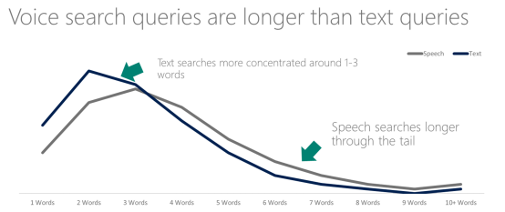
Dave Gregory, Content Marketing Manager from the UK based performance marketing agency, SiteVisibility, predicts that 2019, and not 2018, is going to be the real year of voice. According to Campaign, by 2020, voice search will account for about 50% of total searches. In addition, the study also goes to say that voice queries are longer than their text counterparts.\
Picture credit: Campaign
Hence, the year 2019 will bring a shift of focus towards answering the questions and solving user’s problems. For example, there’ll be more emphasis on terms like “what”, ”where”, “when”, “how”, and more. We also feel that as a starting point, the steps taken by people to try and rank for featured snippets will be a good place to start from to explore voice search.
Video marketing is something that you should invest in
According to Forbes, “65% of executives visit the marketer’s website and 39% call a vendor after viewing a video.” Users have been increasingly depending on watching videos on their mobile phones. Well, with the number of mobile users increasing, it means that the design and production of videos are now starkly different from what we have experienced earlier on our screens. With a variety of screen sizes of the mobile phones and tablets, you have to optimize your videos accordingly. While we now come across lots of vertical videos, some are switching to the more popular square-shaped videos.


