While shopping on the eCommerce stores or marketplaces, customers already have a product in their mind prior to visiting. If your site is popular, customers simply land on the home page and place a search request for the product they wish to see/purchase.
If they are unable to find the product through a website search result, they are forced to jump off your site and place a Google search instead. When competition is skyrocketing and websites are struggling to get the traffic, would you afford to lose a visitor just because your website search is not competent?
Stay tuned because I am going to inspire you for adopting some awesome website search functionalities. I have compiled a list of some really inspiring eCommerce stores and marketplaces with great eCommerce website search implementation. Hopefully, this list will inspire you to get a similar one on your own store too.
1. Amazon–
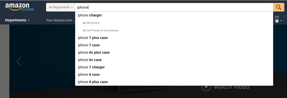
I am a huge fan of Amazon’s website search implementation. So powerful, yet looks so simple with the typical yellow-white color combination. First of all, you can easily spot the Search-box in any screen resolution. Type-in the search string and you get all the possible suggestions in microseconds (depends on your internet speed).
If you have noticed in the image above, the search results are a combination of suggestions based on category-wise filtering and keyword matching. That is, if the product is available in more than one category, you will get suggestions from all the included categories. The other half of the search result constitutes the keyword matching where results are shown on keyword specific suggestions. The best thing about Amazon’s search-box is it handles the spelling mistakes so smoothly.
2.Flipkart–
The Indian eCommerce giant which is a strong rival of Amazon in India has left no stone unturned in improving its website search.
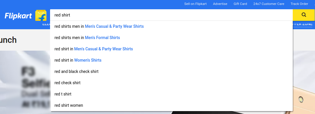
Very similar to Amazon, its search box is themed with White and Yellow color which extends about 60 % of the page width. With a placeholder to guide the customers, it moves a step ahead from the rival site (Amazon).
In terms of efficiency in the search query matching, it follows a similar approach to that of Amazon. The search results are divided into two parts- category wise results and keyword matching.
In fact, I found the keyword-based results more relevant here. The keyword search technique has been wisely applied to sell related products if exact product is not there on the site.
For example, kindle tablet is not available on Flipkart. However, when I placed a search request with string “kindle tablet” alternatively it provided me with the suggestions for related products like covers for kindle tablet and other accessories.
3. Fab–
Fab has probably the most unique website search implementation. Don’t get fooled with the simple, casual, and colorless search-box at the top left corner.
This simple search-box does the wondrous stuff.
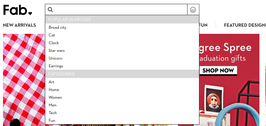
Search suggestions even before you start typing. As soon as you click in the search box, it automatically drops down to show you a list of trending search suggestions. Moreover, the search suggestion is complemented by the direct category wise filtered suggestions. Clicking on the categories will directly take you to the filtered search result page which shows the products belonging to that category only.
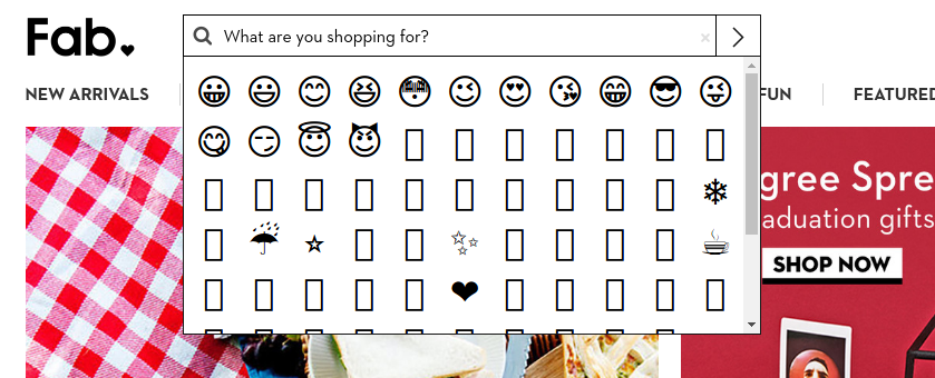
Emoji search. Emoji search makes the implementation so interesting. It’s good to see a website being an early adopter of this trending search technology. I was so engaged with the emoji search, I played like a kid with it. Trying different emojis and see what it gives in the search result.
Surprisingly, emoji search results were really precise.
More detailed suggestions. The search suggestion is divided into four parts.
- Popular products which shows product wise suggestions with price details.
- Common searches include those search strings which are commonly used for the products you are searching. You can also call it the trending search queries related to your search string.
- Alternate searches are based on category wise filtering where your search string is matched and shown in different categories on the store.
- Designers & Categories are more of a combination of keyword matching and category wise segregation.
4. Asos–
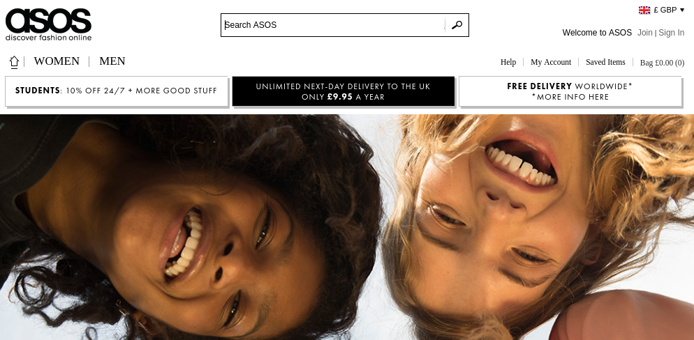
Asos online store utilizes a simple search box which is quite smaller in size as compared to the previous entries in my list. Hold on! Don’t judge the CRO and efficacy of the search box with size only because there is a lot more that makes it stand out.
First is the placement of the search box. Despite it is a smaller sized box, it has been placed at the center of the top bar that makes it stand out. The theme of the box matches quite precisely with the site’s theme.
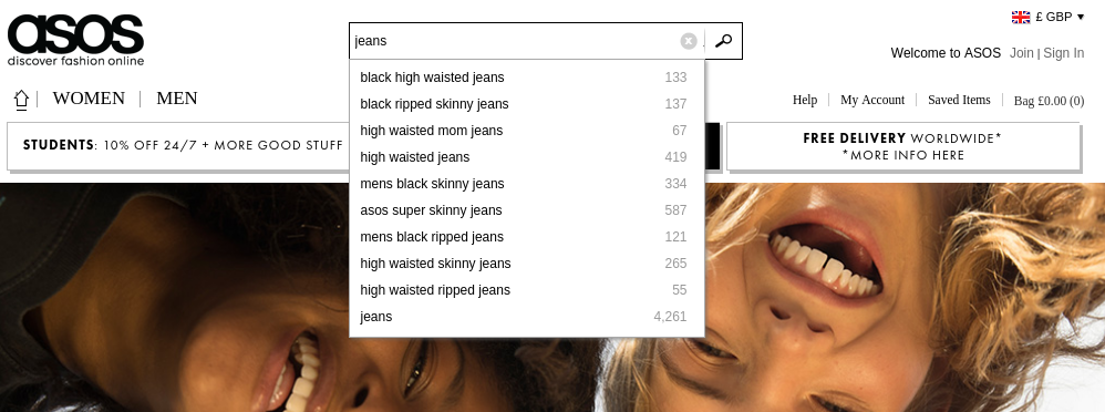
Talking about the search results and search suggestions, whole search suggestion is based on keyword matching that does the job quite right. I did some searching with different search strings, the search suggestions were something like these:
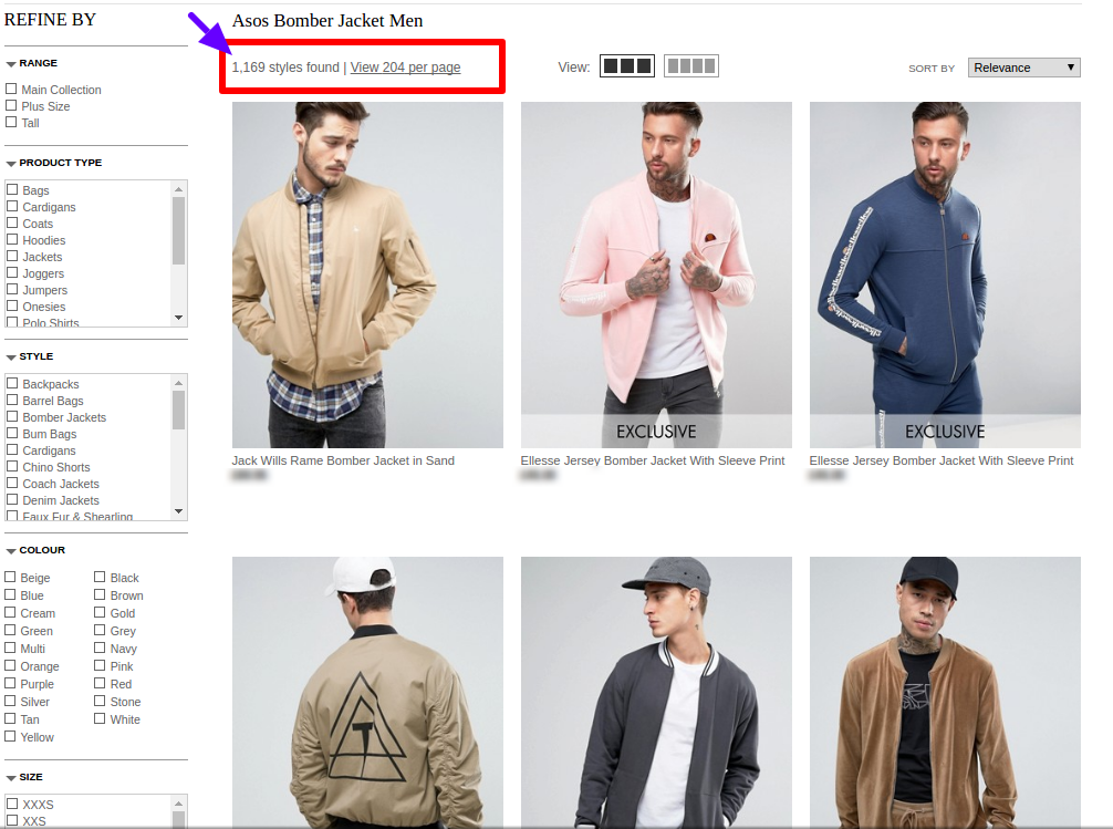
The most interesting thing to notice is the indication number of matches for each search suggestion. That is if the search suggestion shows 1,169 matches, it will show 1,169 items when clicked. Something like this:
Though you might not feel impressed with the simple look and feel of the search box, the precise, and quick search results and search suggestions are definitely inspiring. However, I do not find any mistake in the look and feel too, it has been wisely placed and themed with the site design. It is a perfect example of a great website search implementation.
5. eBay–
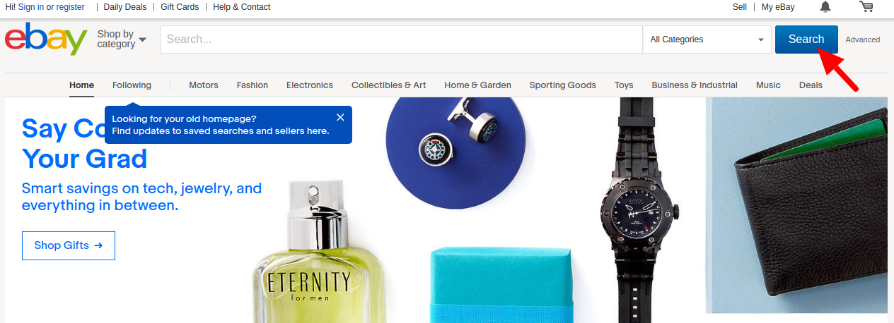
eBay is a perfect example of how millions of products can be easily accommodated in a simple searching console. It follows a bit different approach than all the previous entries in my list here. You will not find the typical magnifying glass icon for triggering the search request. Instead, eBay has simply placed the “Search” CTA button in blue background and white font color.
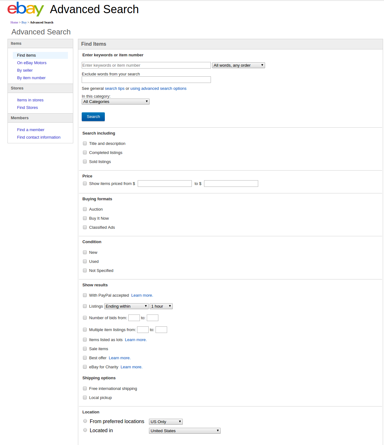
The search box covers almost 90 % of the width with category wise search filter and the advanced search option. With advanced search option, you can place a more filtered and constrained search request. This filtering is done by selecting various options in the search setting of advanced search which looks something like this.
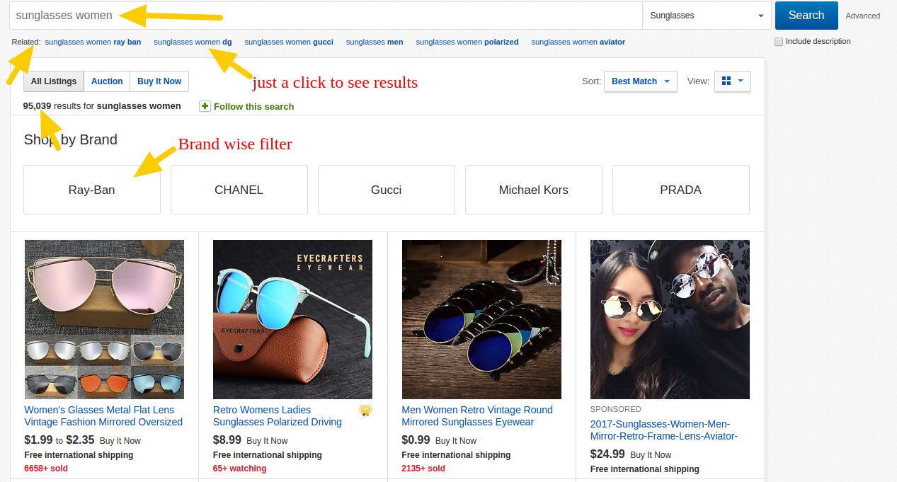
The search suggestion is quite similar to Amazon and Flipkart where it utilizes both category wise suggestions and keyword matching. The most interesting part is the search results page. Even on the search results page, you will get some more search suggestions in form of ‘related search queries’ which can be easily accessed in just a click.
6. Mensuas–
Mensuas, the American online retailer for premium undergarments and outfits, has done a quite impressive job with the search suggestions. The search box is well placed at the center of the top bar where “Search ” CTA button has been used in place of the trendy magnifying glass icon.
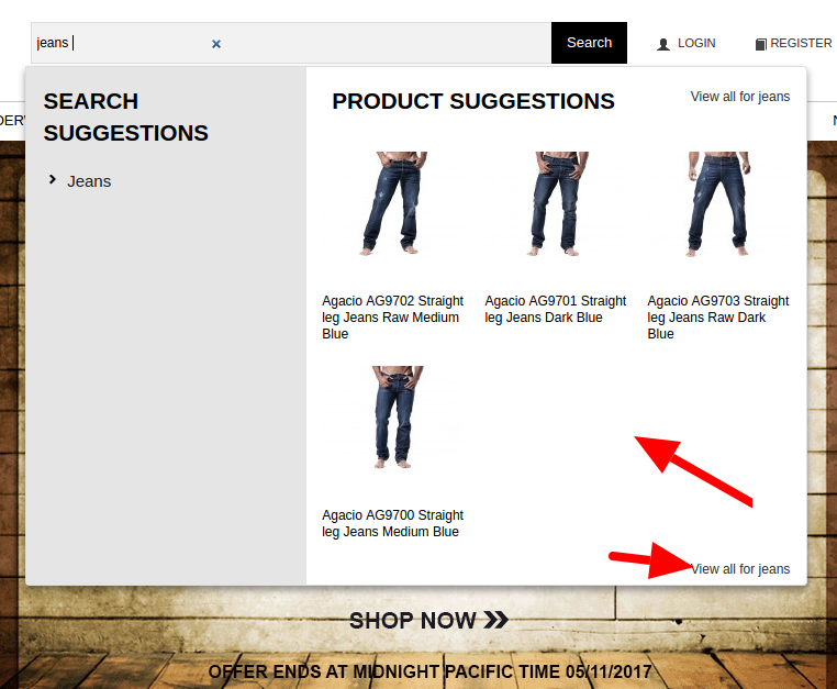
Coming back to the search suggestions, it follows the same keyword matching and category wise filtering, while there is one more thing to notice- the product suggestions with pictures.
The product suggestions with product images thumbnail make it quite easier for the customers to see the products directly in the search suggestions. Moreover, customers can also choose to view all the products matched with search query by clicking “view all for” at top or bottom of the search suggestion box.
7. Knowband–
Knowband is quite different from all the entries in our list here. It is an online retail for “Downloadable Products”. That is, no physical products are there. They are simply, different applications, plugins, addons, and extensions for eCommerce platforms like OpenCart, PrestaShop, and Magento.
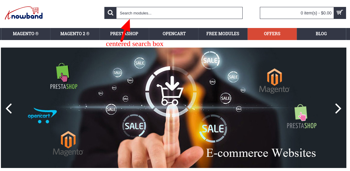
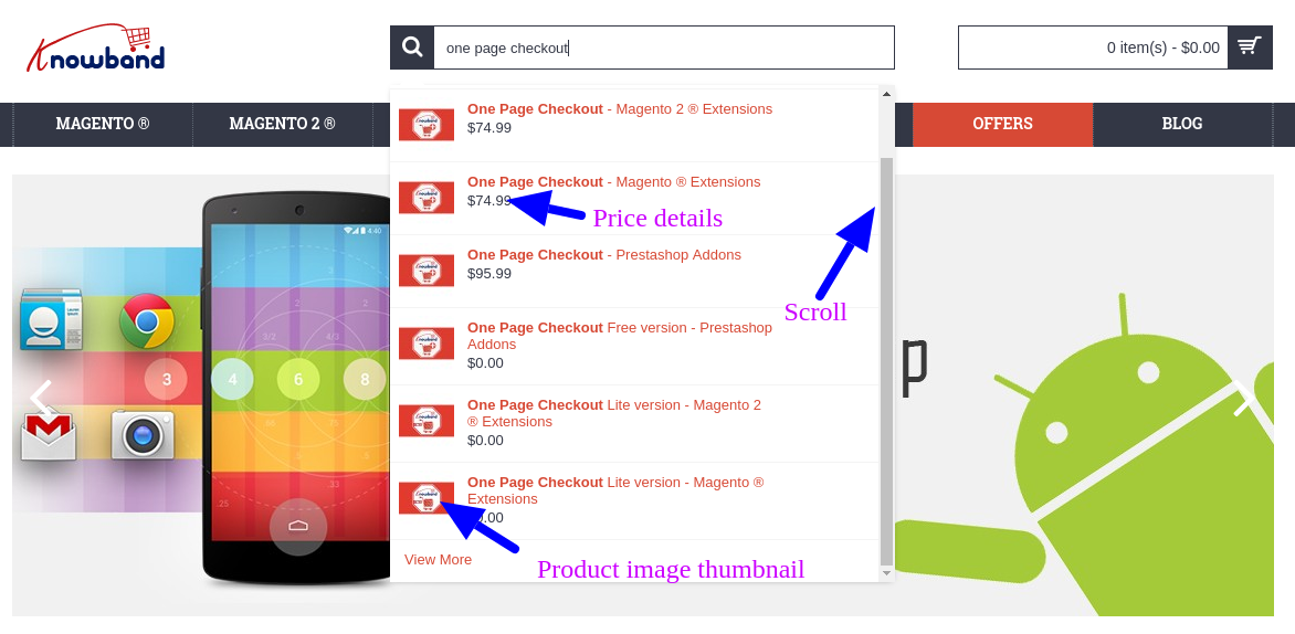
Being a development firm itself, it has not failed to implement an impressive eCommerce website search for its home ground. The search box fits well with the website theme where a focus has been created by putting it in the center of the top bar.
The search suggestions are quite precise and comprehensive with product price details in the suggestions itself. The suggestions directly show product results with a scrollable option to see all product suggestions by just scrolling them down. Clicking on the search suggestions will directly take you to the product page.
To conclude
All these websites have implemented the website search features as per their domain and requirements. For all of them, keyword matching is a quite crucial implementation. With some innovations, each of them stands out quite well. For example, emoji based search on Fab, product image on Mensuas, pricing details on Knowband, and advanced search on eBay, all of them have something unique to get inspired from.
So, if you are on a mission to implementing an efficient eCommerce website search on your store, which website inspires you the most? Definitely, there is something to take from every entry in the list here. Let us know if our eCommerce website search development team can help you in your mission, we are just a click away.

