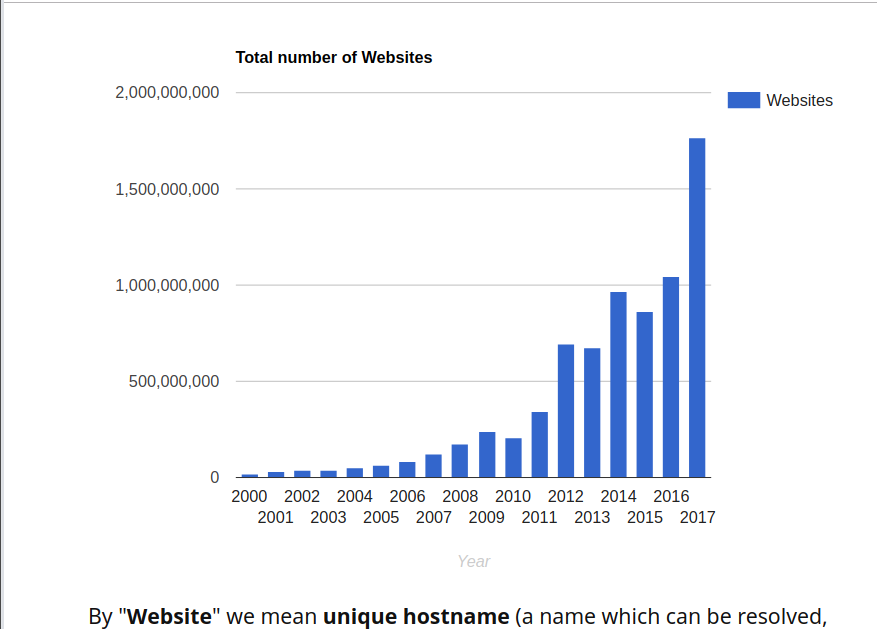
As the last count, there were about 1,766,926,408 and running number of websites currently.
Picture credit: Internet Live Stats
Think of it in a way that – how can an individual website or brand make it through to the top of the list among so many websites across the globe? Functional inbound marketing is definitely a great help. However, even the most advanced and effective SEO tips won’t help you get to the top of the list or do anything for you if you can’t get visitors to stick around. Amazing web design is a key component of a good inbound marketing strategy and there are a number of things that every well-designed website needs to have. You can either invest in website development services from an agency or do it yourself with a team, what matters is that website development must have the aspects mentioned in this post.
These elements – when fitted together tell a lot about a website in a form of a story. Other elements work to improve how content looks on a specific device. While it’s not necessary to include every trend that comes about on your website, many of them have the potential to improve your visitor’s experience.
This blog lays down the different website development aspects that make a difference for the company.
Originality
The eCommerce industry has always been about the originality of the websites. With so many websites copying each other’s designs, layouts, images, and text, you have to make sure that your website and all its elements are original. How can you ensure that the website is an original one?
Turn unexpected elements of your website into interactive tools
Present your product or your brand in a new way
Use memorable images and backgrounds
Large typography
Typography is something that if you have a unique one, your customers would be able to recognize you without any second thoughts. That applies to the font as well. In recent years, designers have received a larger selection of fonts to choose from, making it easier for brands to more accurately express themselves through typography.
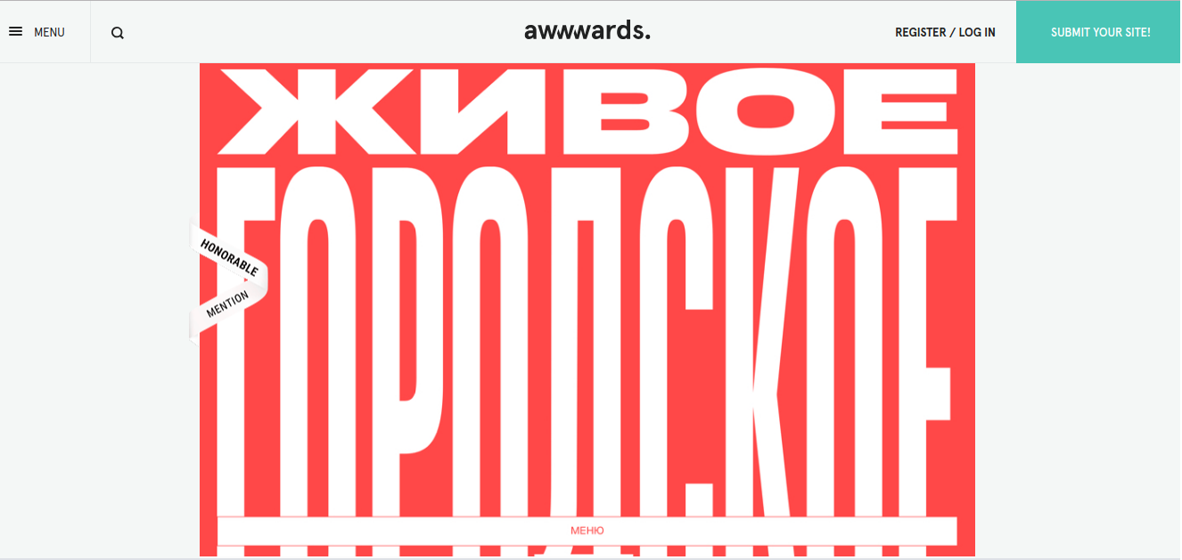
For example, Awwwards. is recognized instantly through their use of unique font, larger than life typography. While more unique fonts, such as Blokletters-Balpen, have begun to be used by startups and technology companies like Zero.
Typography incorporates one design trend throughout the entire website to make sure that the readers browse the different parts of the website and spend time on them. The choice of typography on your website indicates what kind of a website are you. Whether you’re a fun one or a serious type, functional or informational and more. Regardless of what font you choose, be sure that your designer considers its applicability across browsers and computers. Choosing a font that is not supported by common browsers and computers could mean that your website displays awkwardly on different devices.
Background videos
Have you seen the videos that automatically start playing in the background of the website? Well, the videos that play tell a lot about your website/page. For example, “How xyz works?”, “What will you be able to find here?” and many another kind of videos you’ll find on the website these days.
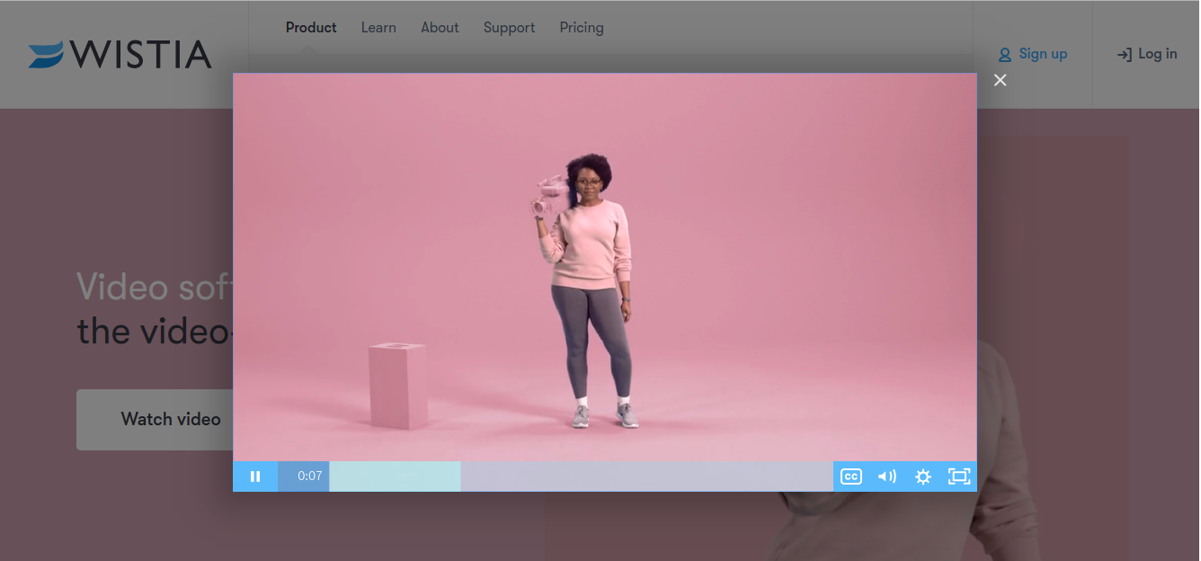
For example, we’ll talk about a website called Wistia. The moment you come to the homepage of the website, the center space is taken by a video that automatically starts playing in the background and when you click on the video, you will be able to explore more in the website.
This background video serves as a brilliant way to get the visitor engaged to click-through to the main video.
Picture credit: Wistia
Videos are the enticing elements on a website and tell a lot about the same. They capture the attention the moment the customer’s lands on the website and pushes the visitors to go ahead and explore more. The video allows your visitor to understand the key points about your company without ever having to read a single line of text.
According to Demo Duck, the video is processed 60,000 times faster by our brains compared to text. This is a human tendency that they might skip reading big texts, but will easily watch a video that has the same content. It also helps that connection speeds are increasing and mobile device sizes are growing, making for better video experiences.
Hamburger Menus
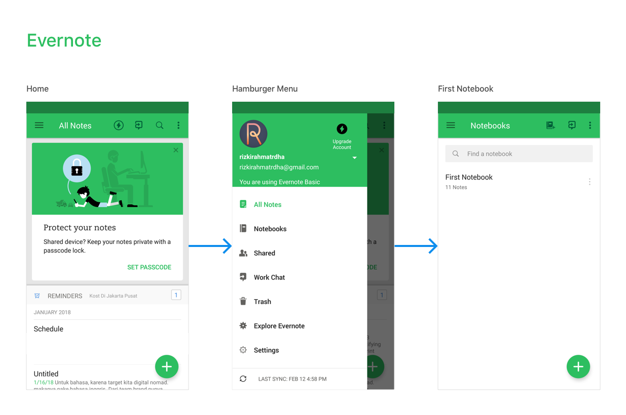
You know what “Hamburger Menus” are? Well, hamburger menus are the collective “three lines” on the top left or right corner that expands when clicked with more options. The image from Evernote has a hamburger menu for example.
Picture credit: Evernote
Apart from making the website design look clean, this menu can take the visitor directly to where they want to go. Well, once opened by the visitor, the option takes a lot of space on the screen. This menu was common in web applications before making it’s a way to website development and design — even in Google Chrome, you can find a hamburger menu on the right-hand side.
Connecting with Social networking platforms
Social networking platforms are now a well-known way to drive conversions, feedback, entry, and exit on your website. Well, with a thought-after process and detailed analysis must take place while you are designing a website. Most of the customer that visit on your website will be entering through their social networking platforms like Facebook, Instagram, SnapChat, and others. So, ensuring an easy passage for them means to ensure the effectiveness of social social login feature of your website.
The development phase should include a proper strategy for how you are going to use these social connects to optimize your conversion rates. From, social login to social media optimization, everything is important and should have a proper place in your website development plan itself.
Conclusion:
Have a strategic and planned website development process. Make sure you invest in the proper techniques or hire website development services that would do the work for you.

