With so many options to choose from, the users needs to have a reason to stay loyal to a mobile application. The user interface is thus the most important factor in amplifying the user experience. This makes the app designing a crucial endeavor. Every new project starts with this phase and ends with the same. What makes it a tricky affair is the ever-changing technology and market trends. Hence, no app developer can call himself experienced and an expert in the field as the fast-pacing industry can leave anyone in the eyes of the storm.
Are you about to develop a new app for your business or looking for a development company? The blog discusses some of the underrated and overlooked UX trends that will surely help in customer engagement. Gear yourself up with the below mentioned inseparable design principles and provide your customers the value that they are looking for.
Lesser Hamburgers menus
Looking back at the UX and UI trend of 2016, the use of hamburger menus (the slide out menu that includes three horizontal lines) was on the rise. The simple usability became incredibly popular across multiple devices. Even though menu style was perfect for the limited space on the mobile phone, but these trends have seen a change in the current year.
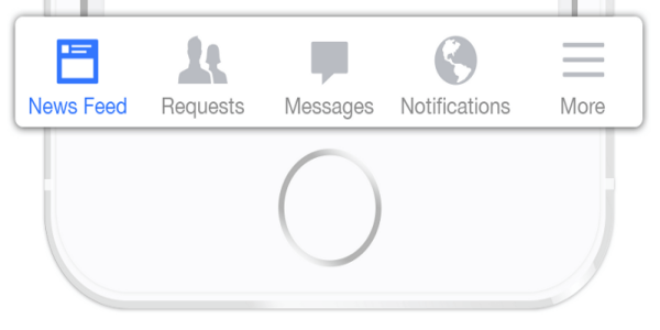
The bottom tab menu is returning to the trend. Even the iOS app developers consider the tab bar as a better user interface. However, you need to keep few considerations in mind. Using three to five top-level destinations in the bottom navigation is recommended. The scrollable tabs are less efficient as the visitors are supposed to scroll before they can see the option.
Epic landing pages
Landing pages are not just a conversion booster on the desktop website, but it is an inevitable part of the mobile apps as well. The statistics of the year 2016 shows that most of the companies relied on impressive images and videos on the landing pages in order to keep the visitors interested. The attractive layout of the landing page is not a new trend, but it has gained popularity in the last couple of years. The very first step of designing an impressive landing page is to identify your target user scenario. The page should clarify its purpose and should be designed keeping in mind the need and requirement of that targeted segment only.
Iconography
Iconography is a visual language used in the designing the application that represents features and functionality. With the limited space and the need of conveying as much information as possible, iconography has seen a rise in demand in the last few years. It even makes the UX fascinating and the design appears visual appealing. However, sticking to the conventional icons is recommended as the simple visual elements are recognized easily. The visitors are in a habit of seeing few icons and may get confused with new ideas. Consistency is the key in this aspect. It implies that each icon should have equal weight and size.
Real-time features
While animation has been a success in the mobile app development in the past few years, it is now time to take the user experience to the next level. With the virtual reality, anf augmented reality taking the front seat in the technological progression, even the mobile applications should offer these real time features to the users. The virtual fantasies are not just a must-have in the gaming apps, but will even provide a competitive edge to the eCommerce apps. The 3D architecture and the location-based interface will become a deciding factor in determining the success rate of an app.
Personalized UX
The more personalized the user experience is, the better it will be. As mentioned above, the real time interfaces will standout in the crowd, this makes the introduction of Chatbots a must. The real time question and answer facility will help create a emotional bond with the visitors. Along with the design should be responsive and should be able to adapt to all the hand held devices such as iPad, tablet, and others. Not just this, the personalisation should be demographic responsive as well.
Minimalist interface
Too many design element and heavy videos may increase the load time. Nothing adds to the bounce rate more than slow load time. Hence, the UI design of the app should be minimalist. Keeping the design simple and to the point is the best way to delight the users. This will even aid your quest to provide the recurring value to your visitors. The audience should not struggle while using the app. They won’t stick to the app is they don’t enjoy the experience. However, the faster and easy to understand app should be visually appealing at the same time.
Product roadmap
User retention is the biggest challenge in mobile apps. According to a study, nearly 77% of the users lose their interest after 3 days of the initial install. Surprisingly, the most successful app, Pokemon Go has lost 10 million users since its release. Thus, the customer engagement holds the biggest challenge for the eCommerce stores as well. Product roadmaping keeps the application fresh. You just allow the handheld devices to be a weekend novelty. Even the top iOS app developers release a new version every 30 days on an average. Along with product mapping, involving the capabilities of account feedbacks, user testimonial and other engagement data are some of the ways to keep the app in front of the eyes of the users.
Wrap up
With the saturation of the market, finding a place in the everyday life of the customer is a tricky affair. This makes the creation of an attractive user interface inevitably. Only a flawless design can provide the user experience that can fulfill your dream to establish your app in customer’s mind. The transition to a mobile eCommerce scenario may appear simple, but it includes a lot of head storming. Opt our mobile app development services at Velocity and optimize your business fortunes among your rivals.


