“People are making decisions faster than ever before, and they expect to be able to act on those decisions instantly. We as marketers can make it even easier for people to get things done.” ~ Google’s VP of Marketing for the Americas Lisa Gevelber.
Taking a deeper look into the customer behavior, a recent report showcased the instant gratification and impulsiveness of the online app users. The Mobile App Development ecosystem witnesses an update every now and then. Moreover, the growing expectation of the consumers as well as the competition has made it inevitable for the iPhone as well as android app developers, to stay abreast with the opportunities and limitations of the industry. Not just this, with the increase in the use of mobile apps, switching from the desktop to the native and web apps are a must.
This update is not just about scaling down the design, but it involves a lot of other aspects. Listed below are some of the limitations that you may face while developing an application. Check them out.
Slow typing
Typing on the touch is keypad is slower than that of the desktop computers. The slow typing is much more error prone, especially when it comes to filling the forms. Hence, the developers need to keep this aspect in mind. The registration forms should have pre-select defaults. The auto-fill option with the permission of the user is another helpful option. This is one feature offered by Android 8.0 Oreo. Not just the SmartPhone, but even the iPhone mobile app developers should keep this aspect in mind. The use geodata, inline validation in the form fields and the methods of suggesting corrections in the input are some of the ways to deal with such issues.
Inaccurate touch control (Fat-finger problem)
It is proved fact using the fingers to click the links and buttons on the screen has reduced the accuracy of clicking. This inaccuracy is because of the “fat finger problem”. So, consider the size as well as the proximity of all clickable elements. The navigation links and the buttons should be far enough for any human finger to click on them conveniently. At the same time, it is important to note the number of clickable links that you are including. The chances of clicking on the wrong element are more obvious when there are numerous elements. A typically better is to have an Undo feature in the application that allows the user to revert or constantly interrupt accidental clicks.
Not in sync with next-generation search
In a recent post, Google gives an insight of the consumer behavior. As per the report, the expectations of the customers for ‘right now’ are on the rise. While the word-of-mouth is still a deciding factor, the people tend to make on-the-spot decisions more often. With this progression, there has been a boom in the technological advancement. The advanced Voice Search is one of the most speculated progression. Hence, the user interface of the mobile apps should integrate such options. Not just this, the applications should be versatile enough to recognize the gestures of the user. It is not just important to optimize your eCommerce website for the next generation Search, but the handheld applications should be in sync with these latest updates of the industry.
Poor internet connectivity
While some of the native mobile apps work in offline mode as well, the web apps require a strong internet connection. Since most of the data of these apps are stored on the server, the connection plays a very vital role in their operation. The connectivity issues and slow download speeds of the smartphones is a very common problem. Even though this issue comes up from the user’s end, this can still be a cause of installation. Lowering the download footprint your app will make it fast. Using CSS3 effects instead of images is one way to make the footprints slows.
No personalized content
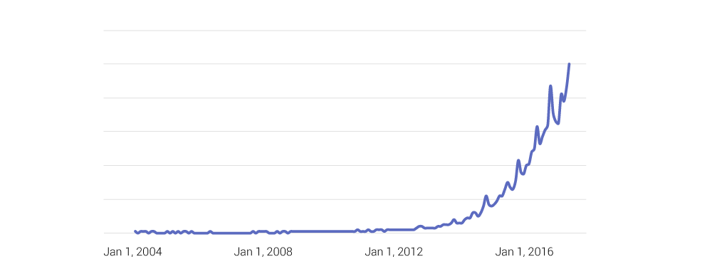
As mentioned above, the ‘Right now’ attitude of the customers is on the rise these days. Hence, most of the queries are made that requires personalized solution and answers. Hence, the contents written in the app should be personalized. As per the report shared by Google, Open Now’ searches are on the rise since 2016. While the search for ‘Store timing’ has reduced. Hence, the content should be optimized in such a way that it tracks the timing and provides the apt information.
Image Source: thinkwithgoogle.com
Whether it’s a mobile eCommerce store or a service-based app, the contents should be informative enough to facilitate the on-spot decision-making abilities of the user.
Lack of local reference
With the introduction of voice searches, the customer search more generic questions instead of keywords. For instance, ‘Where I can find a service center nearby?’. With such queries, Google will give preference to the app that location-based services such as Justdial. GPS support and location tracking mechanism is a must to determine the current location of the user. The use of local reference in the contents will allow applications to offer location-aware services. It is said that mobile searches related to “same day shipping” have grown over 120% since 2015. Not just this, the travel-related searches with the keyword “tonight” and “today” have grown over 150% on mobile. Hence, the contents of the application should not lack the use of local reference.
Over to you
Even though the limitations is an exhaustive list, the above mentions are some of the common ones that require consideration. The iPhones, Smartphones, iPads and other such devices have opened a whole new world of opportunities for the online players. However, in order to tap the ocean of opportunity, you need to focus on customer engagement. Find out the solution for the pain areas of the customers and you’ll be able to acquire and retain the users. Bridge the gap between user experience and user interface by dealing with these limitations gracefully and stay in line with the new virtual space.


