E-Commerce is a huge arena. Everyday a new entrant hits the floor with its new offering. However, when one decides to finally purchase something, not every eCommerce site comes in his preference. You need to provide hundreds of reasons for convincing a customers to purchase from your site, but only a few reasons are required to pick you out the preference list. Interestingly, mistakes in your eCommerce website design is the major supplier of the reasons for ‘not to buy from you’.
Today, I will go over five biggest eCommerce design mistakes that I commonly notice on most of the shops I visit as a customer. I would suggest you take a note if you are, by any chance, making these mistakes, as I shall also discuss the solutions to fix these design mistakes.
1. Design mistakes making your website load slowly-
Yes, it’s generic. Everybody knows it; if your website is slow, it will kill your conversions. But how many website owners do really care about it, and how many website owners do actually try to work it out?
Stats say “ 47% of the customers expect a web page to load in 2 seconds or less, and 40% will abandon a website if it takes more than 3 seconds to load” It means that if your website is taking more than 3 seconds to load, you are losing almost half of your conversions without even knowing. So, it’s not generic at all.
A research done long ago on Walmart revealed that “for every second of improvement in the website loading time they experienced a boost of 2 % in their conversion rates”
Furthermore, the stats received from TagMan while running a test with Glasses Direct revealed that their conversion rate peaked at about 2 seconds page load time, but right after that, every additional second dropped the conversion rate by 6.7 %.
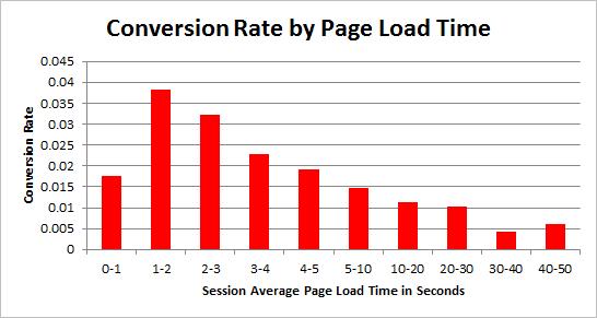
These stats prove that how important is it for you to get a hold of your website’s loading time. There are multiple reasons and design mistakes that increase your website loading time. Some of the major reasons can include:
- Using Flash excessively
- Using too many plugins without optimization
- Too many broken links on the site
- Unoptimized coding without following the standards
- Uncompressed or too big images
- Too many and redundant DB queries on a single page or request
Improve the website loading time is not something that you can do all at once or pass it to post development plans. If you want a faster loading website, you have to be careful right from the website development phase. Though good website developers already know most of the best practices, but still you may ask your developer to:
- Use minimal plugins or use plugins from reputed developers only
- Compress the images before uploading them to the site
- Reduce the server response time
- Optimize the use of database queries
- Use W3C standards for website designing
- Minimize HTTP Requests
- Reduce redirects
- Switch to dedicated servers instead of shared servers.
- Read more ways to optimize Page load speed
2. Not having a strong call-to-action and value proposition-
Value proposition and call-to-action are something that is more related to the marketing side of the eCommerce arena. However, both of them have a strong interconnection with the website designing itself. A proper arena for communicating the value proposition to the customers can only be created if website designers are considering the same from designing phase itself.
As an eCommerce website owner just ask yourself “why one would buy from your site, and not buy from your rival site instead?”
If you can answer this question in your mind from customers’ perspective, within first few seconds after looking at your website, you have a good value proposition.
Now, the main thing, do your customers know the answer? Is your value proposition strong enough to convince them? Have you explained them, why should they buy from you? Unfortunately, many eCommerce websites make this basic mistake and fail to serve a strong value proposition. In fact, a lot of them fail to even communicate what they are selling.
It’s your eCommerce website which should tell the customers about your value proposition, and it is so important. A strong value proposition with convincing call-to-action will serve as an argument to make your website a preferred destination despite too many rival sites.
Fab’s strong value proposition can be easily noticed with its beautiful banners and appropriate call-to-action. ‘You will get everything you need to plan a trip out of town; If you love pets, there are stuffs for you; and you will get everything to glow your home in trendy lights’. That’s called a great use of attractive images, taglines, and call-to-actions to deliver your value proposition.
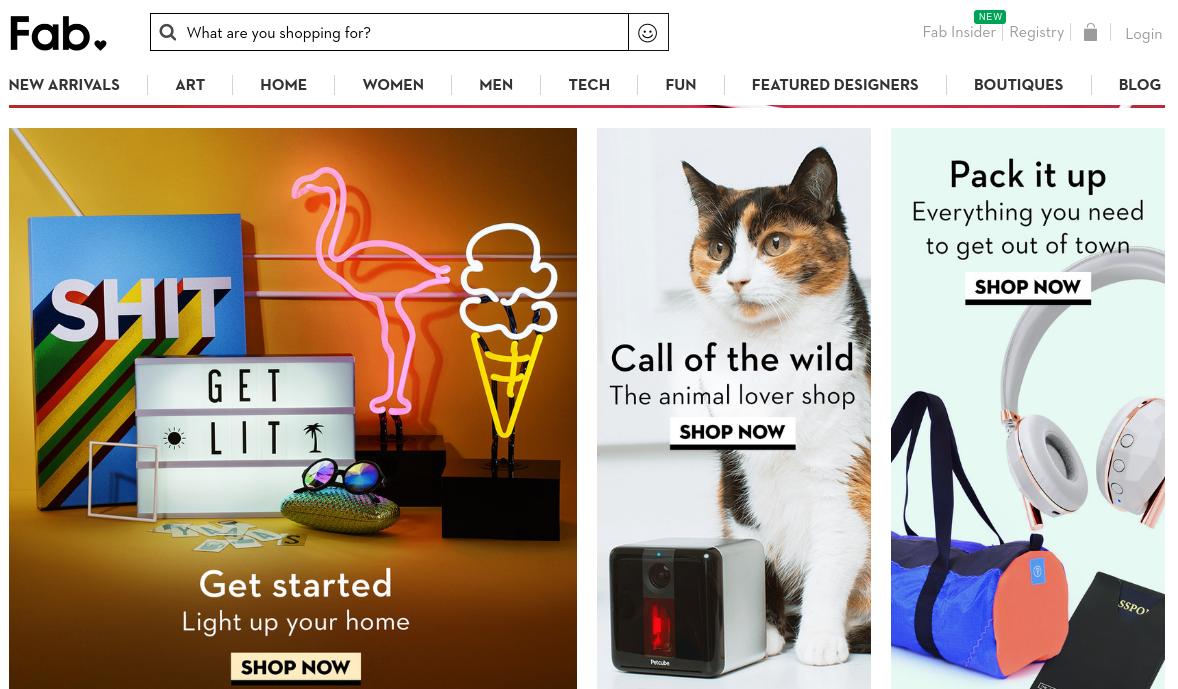
A strong value proposition can be created in following ways:
- Use a headline with the clear, and simple message that easily communicates why one should buy this product from your site. Remember, the headline is a promise of values for the customers. Such as “Authentic, Easy returns, and Free shipping” by Mensuas.
- Feature your offers and discounts using appropriate banners advocating why it’s best to buy on your site
- Use relevant and attractive images in the banner. Real life images of the product in use would be a good choice.
Once people understand what they are buying and why it is better to buy from your site, you will experience a great boost in your conversion rates. However, if you fail to communicate the same, you might face a great loss on conversion front without even realizing the main reason. So, make sure your eCommerce website design or any website template you use, provides ample space to showcase your value proposition.
3. Mistake in images for product description-
The product description is undoubtedly a major determiner of the conversion rate on an online store. Images play a complementary and extremely important role in showcasing a perfect product description. However, often times store owners do a mistake in using the right type of images for certain category of products. The fault is in the image creation itself.
For example, when taking a product image for television it would not be wrong to use an image with white or blank background. However, it would be a mistake to take a product image for a TV stand in the white or blank background. Instead, you should use the natural background in real context of a place where TV stands are generally kept in the house.
The reason is, while browsing through the product page of a television, a customer might be more interested in knowing it specifications, rather than how it would look in the room. But the same customer would be more interested in knowing how it would look in the room if he is buying a TV stand.
This jewelry product page on Amazon utilizes both the white background images and real context images to give a well-informed product description.
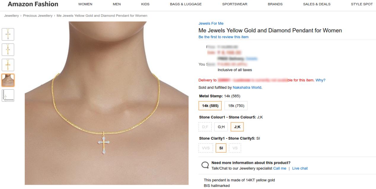
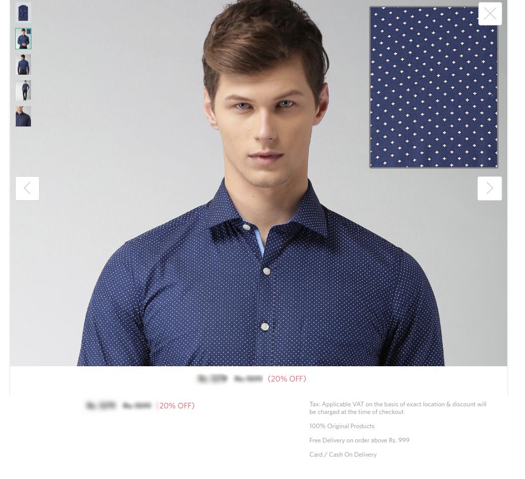
You can also take a cue from the Myntra’s product images. It provides the high quality product images in all possible angels. The close view is so clear that you can even feel the fabric quality by seeing the image itself.
Use of correct background in the product images is a very crucial aspect that might misguide or confuse the user if not taken properly. You must understand which product on your site would require which kind of product image.
Stats say that almost 84 percent of communications will be visual by 2018, and 79 percent of internet traffic will be for visual content.
Even, in our 5 tips to improve eCommerce website search functionality, we have explained how product images in the search results improve the click through.
When visual content on your website have become so important and are having such a great scope for awesome website engagement, it would be a mistake to ignore even the tiniest aspect. Product images, category images, and banners are the major provider of visual content on an eCommerce website. It would be wise to make sure they are correct, optimized, relevant and informative for your audience.
You can learn more about creating good product descriptions here.
4. Mistakes in checkout process-
The checkout process does not only involves what customers do on a checkout page, but it equally involves what steps they follow to finally land on the checkout page. You may be using a single page checkout on your website, but it will be of no use if visitors can’t even reach to that page easily.
Most of the times, I get amazed with the websites that ask for dozens of clicks to add a product to the cart. Some of them would want you to necessarily visit the product page even if they show an “Add to cart” button right in the category or search result page.
Just imagine, you see an “Add to cart” button, you click on it hoping to add the product to the cart and then checkout with it. However, instead, you are taken to some other page where you have to perform some more clicks to add that product to the cart. What would be your reaction? Not good I guess.
The same happen with your customers and they feel irritated with the misguiding CTA.
In an ideal situation, your customers should be able to reach and complete the checkout process in 3 or fewer clicks. A single page checkout would be helpful in compacting the checkout process. It should go something like that:
- Click once to add the product to the cart
- Click once to proceed to the checkout page
- Fill the information required to checkout
- Click to Submit and complete the checkout process
There are some studies that show “3 or less click” rule is not a necessity to make your customers happier, but adding misguiding CTA or adding too many clicks would probably be your biggest mistake. You can take a cue from Asos’s category page where is uses a “Quick view” CTA instead of “Add to cart”.
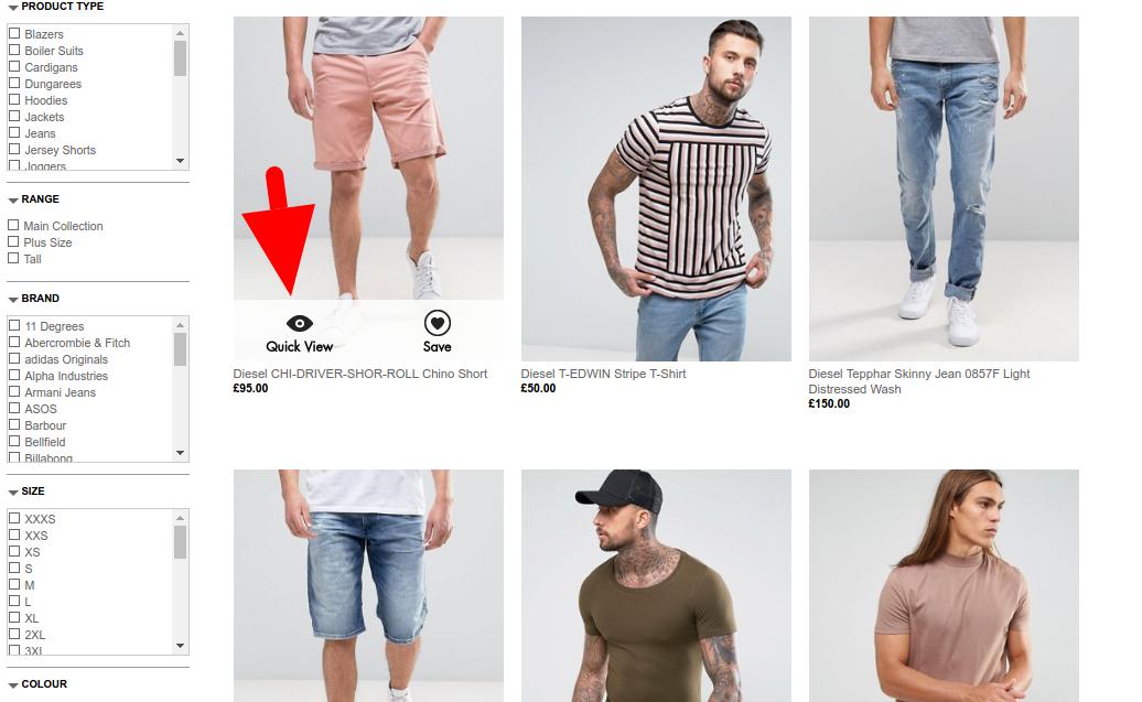
Caption: Add CTA appropriate to the action, if it does not add the product to the cart, “Add to cart” is a wrong name for it.
Description: Asos uses quick view CTA that takes you to a pop up with add to cart option.
5. Unable to prove that you can be trusted-
The fact is, you are no Amazon, eBay, Etsy, Nike, Fab, or Asos. These websites have already built their trust circle for whatever they offer. At least a customer on these sites (and so many other established sites) is sure about their willingness, ability, track records to deliver the promises.
What about you? You may be an eCommerce startup with similar abilities and willingness to serve the customers, but how would you convince your potential customers about that?
Just because you have the same willingness, and ability it doesn’t mean your customers will trust you.
It’s your site which would reflect your trustworthiness for delivering and keeping the promises. But, how can you make your website look trustworthy?
Think basic and think on customers’ perspective- that’s the solution.
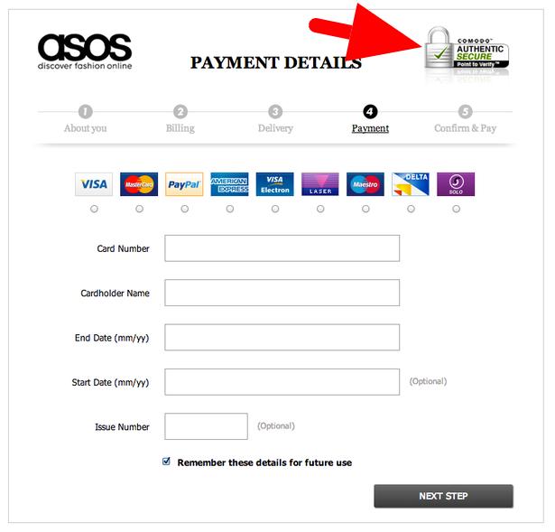
Use logo of trust: Customers generally hesitate to provide their credit/debit card details on a new site and a site that is not so popular yet. To handle the situation, show logo of trust on your checkout page. A logo of trust can be the logo security layer you use on the site for safe transactions. You can take a cue from Asos, despite being a popular site, it does not fail to show the logo of trust on its checkout page.
Showcase customer Testimonials: If words come from one of their kind, and if words come from someone who has been through where they are planning to go, customers believe with more authority. That’s where customer testimonial comes to the ground zero. Put your best efforts in gathering testimonials and feedback from your previous customers and show the best of them on your website. Let your potential customers know that you have a great track record and you can be trusted like these customers did.
Darveys, an Indian luxury fashion shopping site, makes a perfect use of customer testimonials by showcasing them on the home page itself.
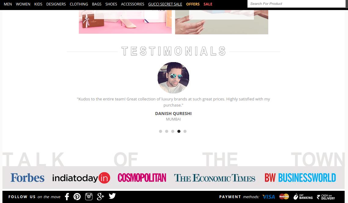
The above example for customer testimonial also brought me to my next suggestion. If you have noticed in the above image, just above the footer, there is a serial line up of popular publication websites- Forbes, India today, The Economic Times, and so on. What’s the purpose of these links on this site? Let’s talk about it in my next suggestion in detail.
Popular Press publications: The links shown just above the footer on Darveys website is a great example of how you can leverage your featuring in the popular and already trusted publications to create your own trust circle. Each of the links shown in the above image directs the user to the publications where the website was discussed or something inspiring was published about the website. Point is, getting featured for your positive aspects on such publications is a big thing. You can brag about it, because it’s an achievement and an influential aspect to tell your customers.
Words of conclusion
A perfect web design might be the toughest to acquire, but a worse design is inevitable with every mistake you commit. You never know which important aspect you might miss out in your copy. The best way to make sure everything goes right is to not to commit these 5 mistakes at least, use the suggestions given here, and get in touch with a reputed eCommerce development company to guide you on various other aspects; aspects that come only through the years of experience in the domain.

